The first six months of 2011 are now in the books. Heat waves are currently in the headlines, but how does the national average temperature compare to other years and ‘normal’? And what does the first half of the year portend for the year as a whole?
The indication is that 2011 will mark the continued return of U.S. national temperatures to conditions much closer to the 20th century mean, down from the unusually elevated temperatures that characterized the 1998–2010 period.
If this proves to be the case, it strongly suggests that the unusually warm decade from 1998–2007, was just that–unusual–and does not best represent the expected trend or the climate state of the U.S. for the next several decades to come.
Background
The U.S. National Climatic Data Center has compiled a data set representing the annual average temperature for the contiguous United States which dates back to 1895.
Figure 1 shows that history, from the beginning through 1997. Over that time, there was really not much worth writing home about—there were signs of inter-decadal variability, but nothing that seemed to scream “dangerous anthropogenic global warming!” The overall upward trend was being driven more by cool conditions in the early decades of the record, rather than warm conditions at the end of the record.
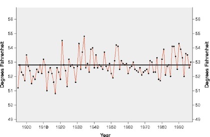
Figure 1. United States annual average temperature history, 1895-1997as compiled by the U.S. National Climate Data Center.
But all that changed in with a big upwards temperature jump in 1998, which was due in part to the occurrence of a strong El Niño conditions in the Pacific Ocean. But in the years following 1998 U.S. annual temperatures remained elevated, even through the El Niño conditions abated (Figure 2). Many thought this heralded in a new climate state in the U.S. as well as better establishing the trend of things to come as anthropogenic greenhouse gas emissions continued to rise.
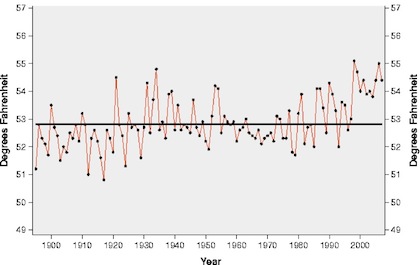
Figure 2. United States annual average temperature history, 1895-2007as compiled by the U.S. National Climate Data Center.
But, then, global warming’s influence on U.S. annual temperatures seemed to be derailed in 2008, when the national annual temperature fell off its lofty perch and returned to very near its 20th century average value.
Then 2009 followed suit, and 2010, while a bit warmer than the preceding two years, was still cooler than any year in the 1998-2007 stretch (Figure 3). Now, after three relatively near-normal years, the 10-yr warm period from 1998-2007 was starting to look to be out of place, rather than the new norm.
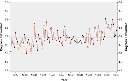
Figure 3. United States annual average temperature history, 1895-2010as compiled by the U.S. National Climate Data Center.
2011 to Date
Ever curious to see how this is continues to play out, I thought I’d check out how 2011 was shaping up, with the first 6 months of the year now in the books. From January through June, the average temperature in the U.S. has been just 0.14°F above the 20th century average.
I’d like to use this information to guide a guess as to the final year-end number for 2011.
Admittedly, this is a somewhat dangerous thing to do, so I am not betting the farm that the behavior for the next six months will follow closely that of the first six months (after all, currently, as much of the country well knows, things are a bit toasty). But, the first six months does provide a pretty decent anchor for the annual temperature and can help frame a prediction.
Figure 4 shows the distribution of the difference between the annual temperature anomaly and the temperature anomaly for the first half of the year for the collection of 116 years from 1895 through 2010. The mean of the distribution is 0.00°F, he standard deviation is 0.62°F (~2/3rds of all data points lie with +/- 1 standard deviation of the mean), and the maximum positive difference was 1.52°F while the maximum negative difference was 1.95°F. I’ve have plotted a normal distribution on Figure 4 to show that the actual distribution, while not perfectly normal, is close enough for my purposes.
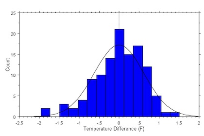
Figure 4. Distribution of the difference between the annual temperature anomaly and the temperature anomaly observed during the first 6 months of the years, for the contiguous United States (Data source: U.S. National Climatic Data Center).
Using the statistics derived from the distribution described in Figure 4, I can make an frame the 2011 annual temperature prediction based upon the observe temperature for the first 6 months of the 2011 (Figure 5). And looking at Figure 5, it seems that there is a pretty good chance that the final numbers for 2011 will fall below the typical elevated values during the period 1998-2007. Marking the 4th year in a row of such an occurrence.
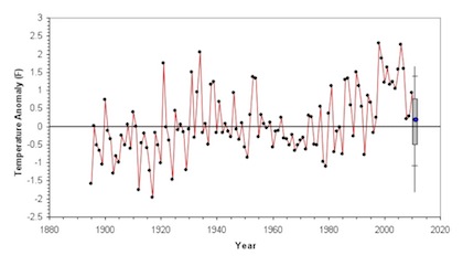
Figure 5. Projected value for the U.S. annual temperature for 2011 based on data for the first six months of the year. The blue dot at the end is the current year-to-date (January through June) temperature anomaly. The grey bar represents the region where there is about a 2/3rds chance that the 2011 annual temperature will end up being. The hash marks above and below the grey bar indicate the region where there is about a 95% chance the 2011 annual temperature will ultimately fall, and the vertical line represent the limits of the 2011 annual temperature, based on observations from 1895–2010. (Data source: U.S. National Climatic Data Center)
In other words, the return of U.S. average annual temperatures to values close to the 20th century average conditions seems to be continuing in 2011.
The 10-yr warm spell from 1998–2007 had the effect of raising the overall trend in U.S. annual average temperature by about 40%, from a value of ~0.75°F/century (from 1895-1997) to a value of ~1.25°F/century (1895-2007) and raised concern than anthropogenic global warming was really beginning to leave a significant mark on the climate of the U.S.
But the last three years, 2008–2010, and now the projections for 2011, lie much closer to an extension of the 1895–1997 trend line than the 1895-2007 trend line (Figure 6).
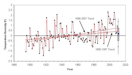
Figure 6. Same as Figure 5, except with the extended trend lines from 1895-1997 (dashed red line) and 1895-2007 (solid red line) added.
If 2011 ultimately turns out to come in in-line with the central projections in Figure 5, it will strengthen the suggestion that the unusually high temperature that characterized the 10-yr period from 1998–2007, were just that, unusual, and do not best represent either the expected trend or the climate state of the U.S. for the next several decades to come.
No comments:
Post a Comment